What is a Wordmark Logo and How to create it?

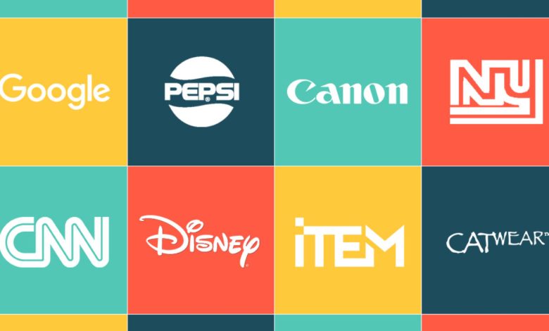
If you want to keep your logo simple and appealing, then the Wordmark Logo Design is the best option for you. Now, what is a wordmark logo? A wordmark logo just has the company’s name with no symbols, icons, badges, etc. The main purpose of a wordmark logo is to make the logo look simple, easily recognizable, and accessible. Logos like these are popular in industries like tech, food, fashion, and media.
These industries use a wordmark logo instead of creating fancy logos to compete and demonstrate. A few of the companies that have wordmark logos are Google, IBM, Coca-Cola, Zara, etc.
How do I know if to choose the Wordmark logo?
A wordmark logo is the best choice for someone who is not a professional logo designer or who does not want a complicated logo. Most of the other logos are quite boring and forgettable but when you talk about a wordmark logo, it’s recognizable and has an impactful result. Most of the businesses have a logo with a symbol such as McDonald’s, Apple, etc.
You as a business owner want your logo to look great and get a positive response from the audience so for this you need a wordmark logo for your brand or company. In some cases, the logo or typography may not be properly visible, so to avoid such problems, you should choose logotypes.
How to design a wordmark logo for your business?
-
The Right Typeface:
First of all, we need to understand what is a typeface? A typeface is the designing of letters in such a way that can create variations among the letters used in a logo. Variations could be in size, width, weight, etc. Since every wordmark logo is designed on letters, you got to come up with the right typeface. You can use adjectives to describe your services/products such as helpful, user-friendly, etc. Using adjectives helps the customers in understanding your business and the services you are providing.
-
Using a different character:
Many giants have used a character feature in their brand name which automatically creates affection in the logo. This differentiates your logo from regular ones and is eye-catching. For instance, Braun and Canon have used character features in their names. But this doesn’t work for everyone. Using this feature can sometimes look strange and you receive negative responses. Make sure that you check if it’s working for you.
-
Play with colors:
If you want to make your logo alluring then play with colors. You can write all letters using a single color or you can play with multiple colors. You can also incorporate a range of colors into a single letter to achieve the same effect as Google. Red, yellow, green, and blue are the colors Google has used in the letter G. Just like them you can also use multi-colors in your characters and make your logo attractive and appealing.
-
Spacing between the letters:
The spacing between the letters is also an important factor to work on. Some companies don’t use space between letters. In the case of a small company name, I would recommend not spacing the name since it would be more appealing to customers. Now if you have a longer brand name, use double spacing so that your characters are clear and visible.
The End
The points that are mentioned above are to make your Wordmark Logo Design look attractive and Attractive Logo Design always generates leads and conversions through it.


